The Worlds Most Hated Synth: Redone
Possessing the “World’s Most Hated Synthesizer” isn’t typically something people brag to others about, and I knew full well the reputation the Akai Timbre Wolf had before purchasing it. There was just something about it. I browsed YouTube to see what people thought about the poor machine, including the now infamous NAMM 2014 unveiling of the Timbre Wolf. You can watch the video below, but it’s pretty obvious by the look on the face of “Dan from Akai”, it was a rough start.
Yet it looked big and exciting, even after all the weird and discouraging quarks displayed in the video above. So I searched for other videos, those made by someone who arguably knew what they were doing with the synth. I found many, many wonderful performances by musicians and artists that showed off the true character of this machine. Below are a couple of my favorites.
So I dove in. Got it used for a decent price (and still decent today).
When it arrived, the box was far, far bigger than what I was expecting. It almost seemed as if someone was delivering a microwave, and it was about as heavy as one too. When I opened it, I was impressed with how tough it felt. Mostly metal body, plastic bottom, great feeling knobs, awesome feeling buttons (a staple to most all Akai’s products).
Then I turned it on… yikes.
Admittedly, it took me an hour or two to understand how this synthesizer worked. It had 4 voices that were all the same build (filter, res, tune, etc.), and outputs for each voice. The knobs seem limited in their abilities. But then I hit a sweet spot, and it started sounding good. It just didn’t sound like any other synthesizer ever made. And that made me happy, the possibilities weren’t endless like some other synths, but there is much to be desired about the art you can make when constrained to certain limits.
Then I played with the sequencer, and finally I found the value in this huge hunk of metal. I went on to program and save many sequences that eventually became songs that I am proud of to this day. In fact, I became such a fan of it, I made my own review of the Timbre Wolf (pardon the beard).
It ended up becoming the most watched video on my channel.
There’s a real saying out there: "never reading the comments to YouTube videos”, and for the most part they are correct. However I am notified every time someone comments on this video and I am constantly surprised by how many people out there actually had a similar affinity for the otherwise much loathed Timbre Wolf.
My decision to keep the machine waxed and wained over the years and I end up selling and then rebuying the Timbre Wolf THREE TIMES. It’s true. It was like a good relationship that I didn’t know how to make work until later on in life. Sometimes you just have to grow personally, ya know?
The most recent time I purchasing it was about a month ago from the writing of this article. I realized one of the main things that kept me from being 100% behind the machine was, as embarrassing as I am to admit it, I didn’t like how it looked.
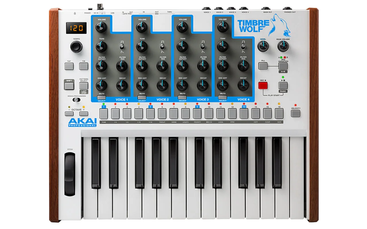
Yes, of course I loved the build, the keys, the metal body- but come on– I’m a designer by heart, I know when things don’t fit well visually. First of all, it’s called the “Timbre Wolf”. Nothing about it’s look felt like it fit with its name. Its stout body was white with light blue and grey letters and markings. It was just too generic looking to be called something that visually stimulating! The layout of everything worked well as far as it’s working components, but the design features on it’s body were too unattractive. So I came up with a plan. I would do a complete makeover of the body of the Timbre Wolf.
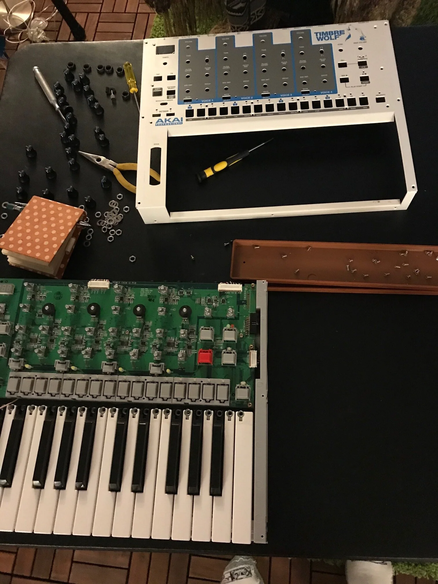
When I took apart the machine, I was again impressed with how THICK the metal they used for this synthesizer was. When I sanded off the top and back of the body, I was delighted by how fast the process went. I had originally planned on sanding it down all the way to the metal, but after the letters came off, I realized that the full thing was already white, so I just needed to apply the white primer to it so that the main color would coat nicely.
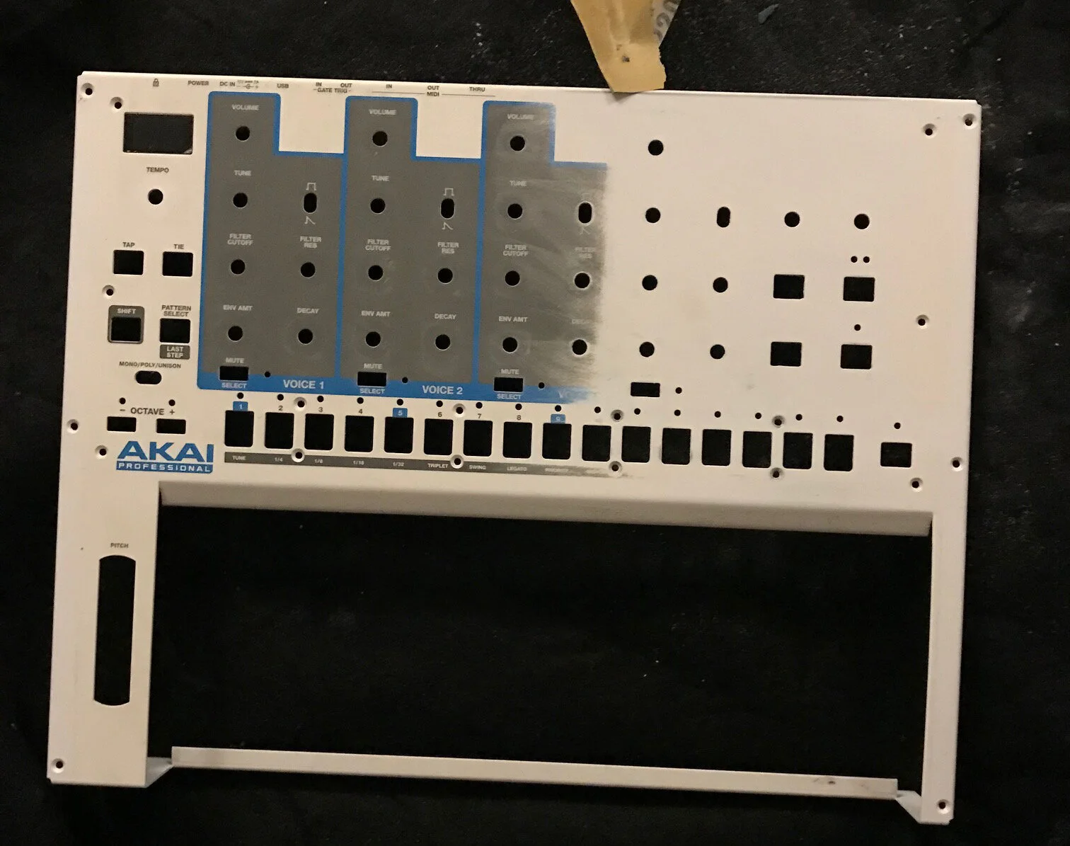
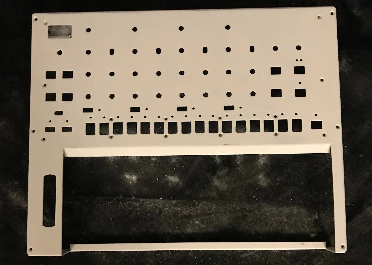
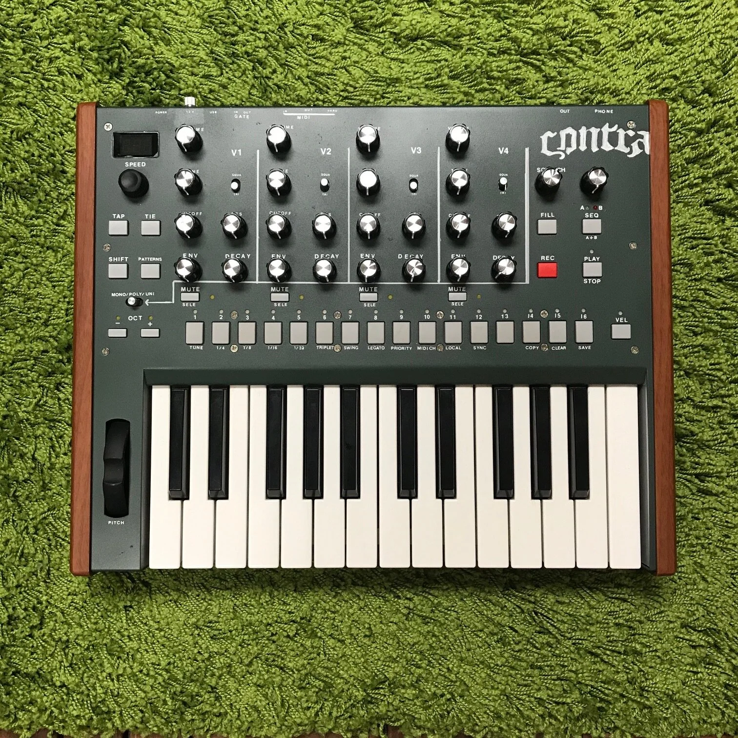
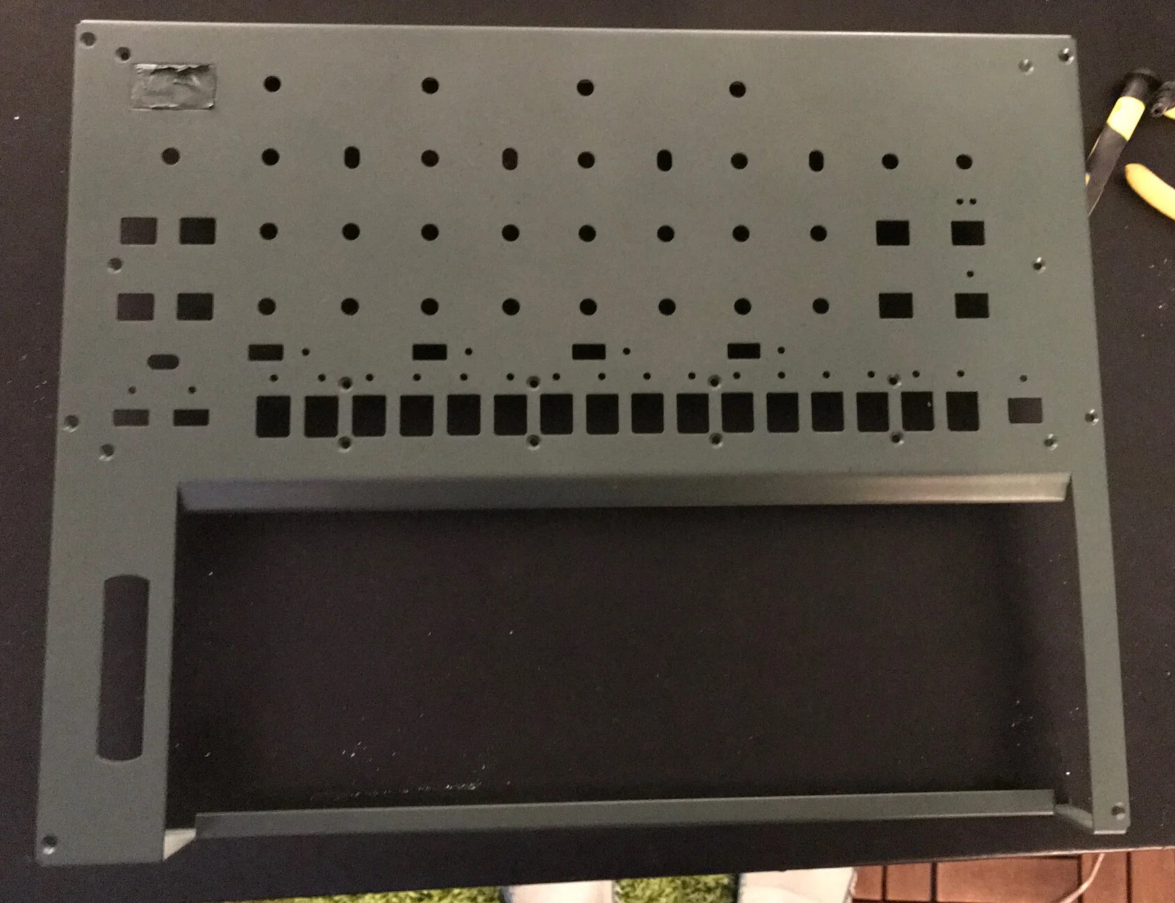
After a day of rest, I applied the dark green color and it came out perfectly. I was already very excited by how sexy it looked.
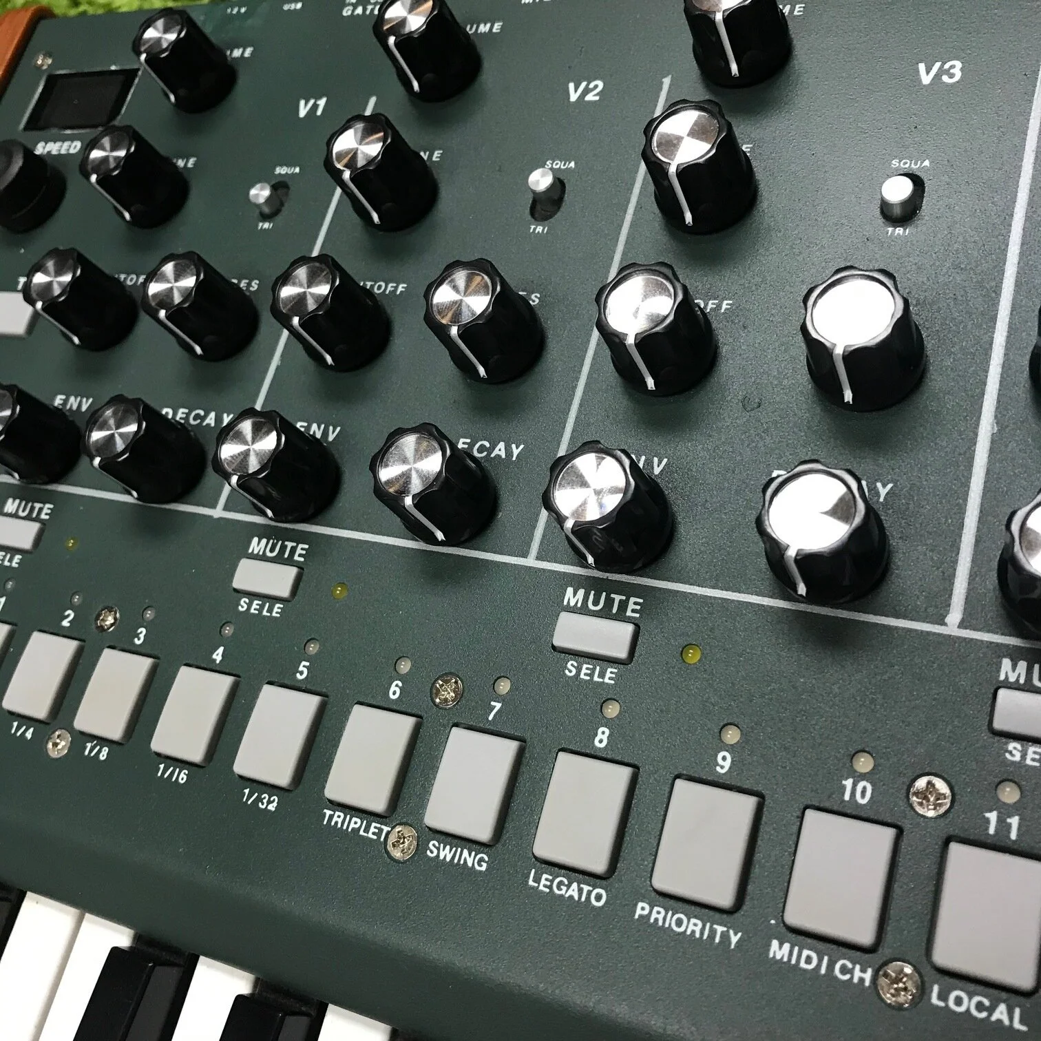
Years ago, when I was going through the design program at Oregon State University, I did a project where I did all the typesetting by using dry transfer lettering. It’s a forgotten medium that is extremely handy and unfortunately, very tedius and difficult to perfect. It involves using a plastic sheet that has hundreds of letters of the alphabet (and numbers and such) applied to one side. I believe the letters are made of paint but don’t quote me on that. You take the plastic sheet and rub the letters using a pencil (or in this case, a flat head screwdriver) to whatever you want to have the letters on.
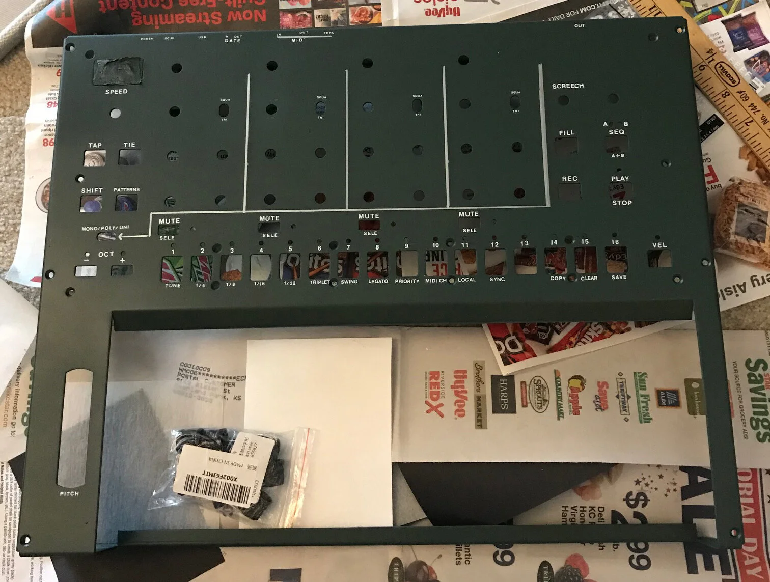
When I started to apply the letters to the synth, I got a real good feeling about how it was turning out. It wasn’t perfect, but neither was the synth itself. I looked great, even when a little off. It gave it a great hand-built, analog quality. When I finished, I realized something right away - it looked almost military.
I couldn’t call it the Timbre Wolf anymore, it needed something that leaned into it’s new persona. It needed to be military-esque, but not obvious. And of course I’m an old video game player and the first thing I thought of was the Nintendo Entertainment System’s shooter, Contra.
I looked up the name “Contra” to see what it meant and it simply means: "against; opposite; contrasting.” It even had a musical definition meaning: "(of instruments or organ stops) pitched an octave below.”
Something about the name felt right. The synth was contrary to everything that had come before it, and it was just a little off of the norm. It had to be named Contra.
But I, of course, had to make it more difficult that that. I didn’t want to use the perfect dry transfer lettering to apply it’s new name. I wanted something that used that military-like quality, but not exactly what you’d see on a tank or something. It needed a stencil. But not any kind of stencil, I needed Old English (I told you I had to make it more difficult on myself). Off to Esty!
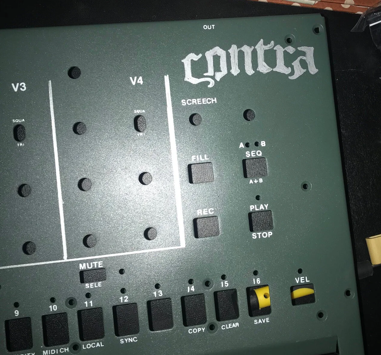
Using the silver marker to do the stencil took some testing on other materials first, but it felt right and it turned out better than I had planned.
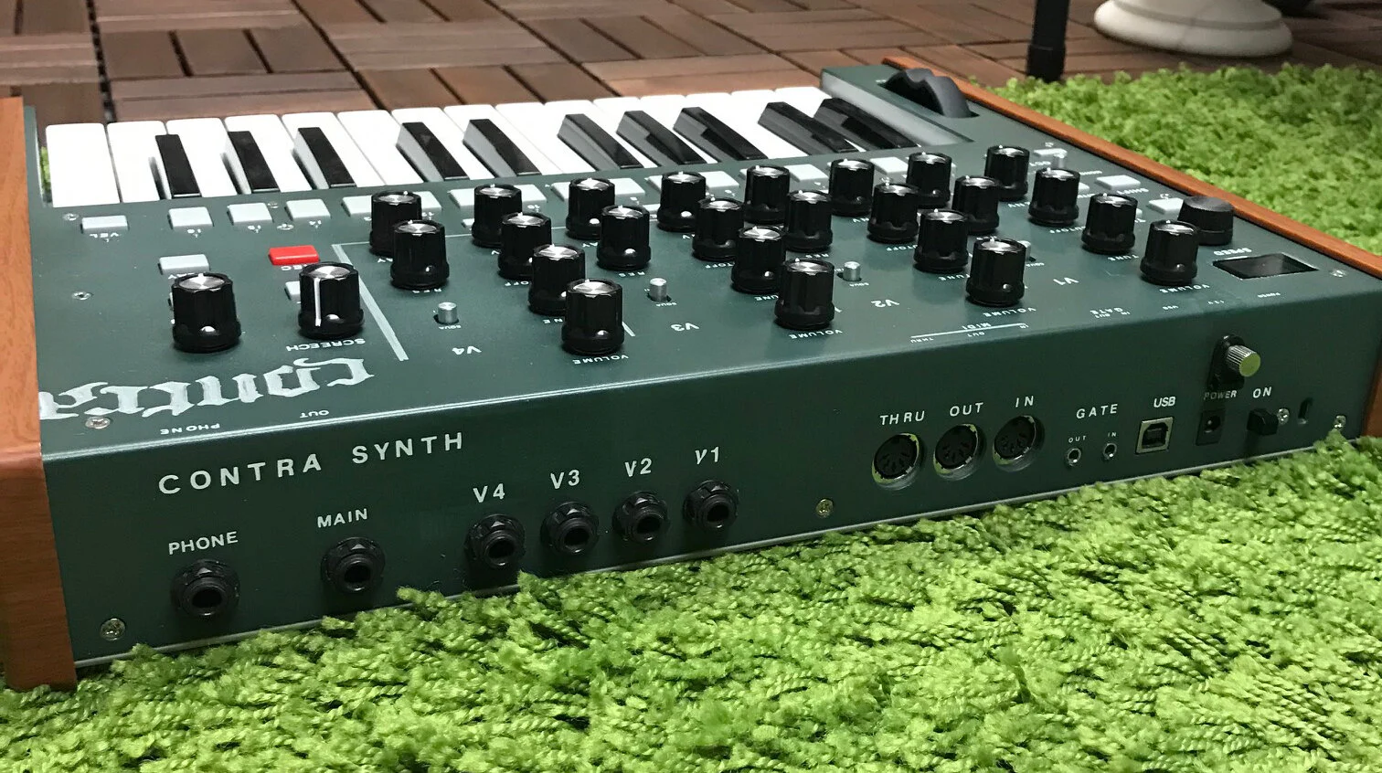
After a quick clear coat to protect the color and lettering, I reassembled the newly dubbed Contra Synthesizer, put some mock Moog-like replacement knobs on it, and plugged it in (hoping that I didn’t screw something up in the process). It worked just as before and when I applied the fake wood grained sides back on, I knew right away they needed to be replaced with real wood.
As of this date I haven’t gone that far, opting to use the original side panels for now. But their color looks great in contrast with the dark green body, so that is something I’m going to want to match when I get to that step. For now, it works.
So good people, behold Contra. A Timbre Wolf in disguise.